Helping Landlords staying on top of their rent collections
About Rental360
Rental 360 is a an application platform that helps landlords stay on top of their rentals, by automatically monitoring payments received, and then sending out notification messages to tenants when rent is not paid on time
My Role
I was the sole UX designer for this project and I was assigned to design the entire experience with the necessary research involved. I completed the web application under 1.5 months (March '18 - April '18).
I collaborated with one UI designer, one project manager and a product owner from the client's side.
I collaborated with one UI designer, one project manager and a product owner from the client's side.
Challenges Faced
1. Understanding the property market in New Zealand
Tenancy system in New Zealand is different from that of the Indian property market. Understanding how the system works, who are the current players in the market was important.
2. Communicating whats needed
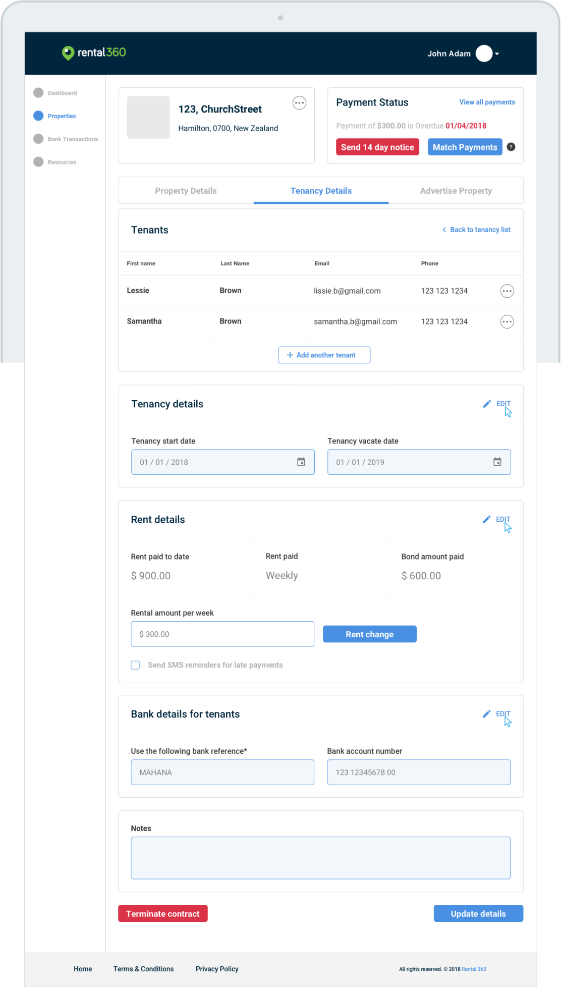
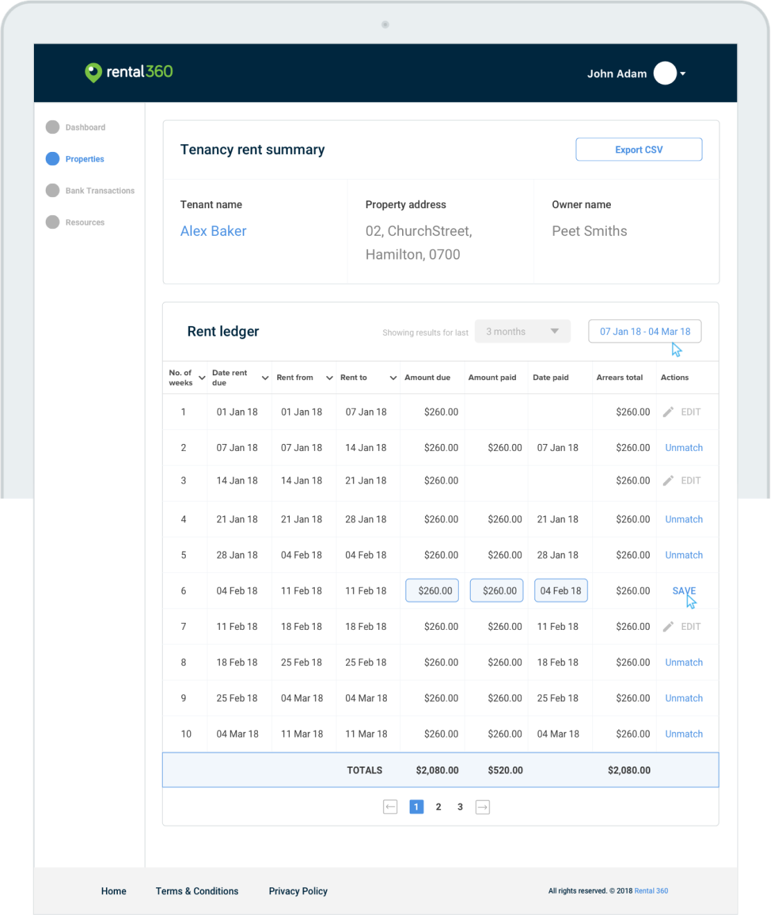
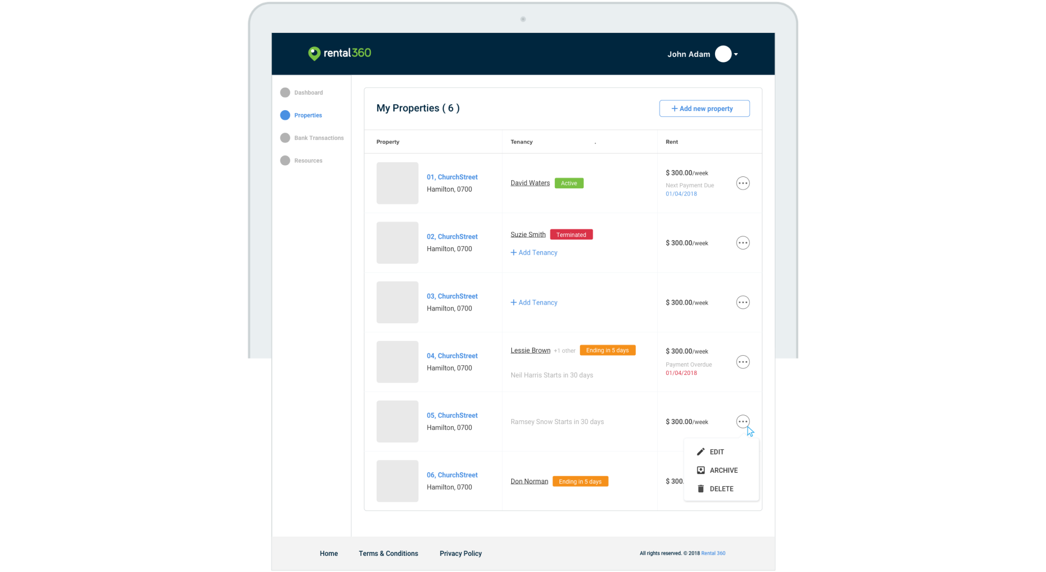
Rental 360 on the surface seemed like a straightforward application with lots and lots of tables. Communicating what is needed in the design through tables seemed challenging due to the number of cases with respect to tenancies that were possible when it comes to a property listing.
Tenancy system in New Zealand is different from that of the Indian property market. Understanding how the system works, who are the current players in the market was important.
2. Communicating whats needed
Rental 360 on the surface seemed like a straightforward application with lots and lots of tables. Communicating what is needed in the design through tables seemed challenging due to the number of cases with respect to tenancies that were possible when it comes to a property listing.
Challenge 1:
Understanding the property market of NZ
Understanding the property market of NZ
The government of New Zealand has an amazing website with resources to everything related to tenancy services which include starting a tenancy, Rent, bonds, bills, ending a tenancy etc.
453,135
NZ residential properties are rental dwellings
355,554
Rental dwellings in NZ are managed by private landlords
33,771
Properties managed by businesses
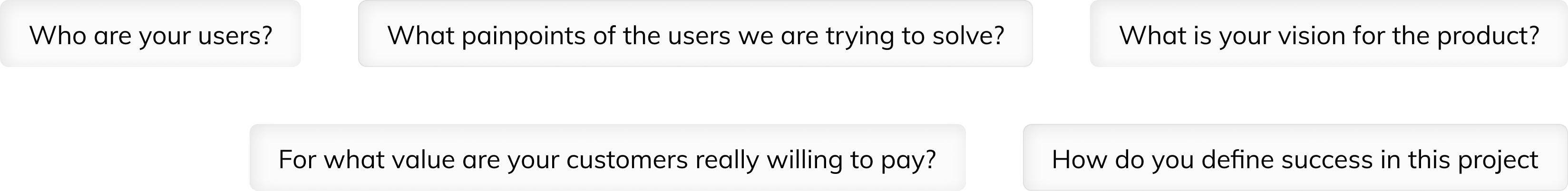
Stakeholder Questionnaire
We sent a set of questions to the stakeholders to better understand the product, goals, features and the users using the product.
We sent a set of questions to the stakeholders to better understand the product, goals, features and the users using the product.
Competitor Analysis
The purpose of the compititor analysis was to measure up the various Online House Rental Platforms against each other. The learnings from this document will inform the decisions in the next stages of the project.
The focus was on the three biggest players in the tenancy space of New Zealand Cubbi, PocketRent and TenanSee.
Metrics were drafted against the following comparison dynamics Onboarding, Navigation, Consistency and standards, Trust Factor, Design.
The results documented are as follows
NOTE: For the purpose of this portfolio document I have chosen only to highlight the result of the analysis at a glance.
• Confusing Onboarding
• Unclear navigation with opportunities for users to get lost
• Consistancy is well maintained.
• Has a clean look, creates a sense of trust
• Looks good, works bad
• Unclear navigation with opportunities for users to get lost
• Consistancy is well maintained.
• Has a clean look, creates a sense of trust
• Looks good, works bad

• Easy onboarding
• Clear navigation and structure users to get lost
• The portal feels cramped with irregular CTA’s
• Pocketrent feels old and out of place
• Pocketrent feels dated and unusable but functions well.
• Clear navigation and structure users to get lost
• The portal feels cramped with irregular CTA’s
• Pocketrent feels old and out of place
• Pocketrent feels dated and unusable but functions well.

• Easy 2 step onboarding
• Easy to follow navigation and clearly defined architecture
• Well defined clear and consistant use of design elements
• Testimonials, Partners and demo views generates trust
• Clean UI with great content seperation and structure.
• Easy to follow navigation and clearly defined architecture
• Well defined clear and consistant use of design elements
• Testimonials, Partners and demo views generates trust
• Clean UI with great content seperation and structure.
Challenge 2:
Communicating whats needed
Communicating whats needed
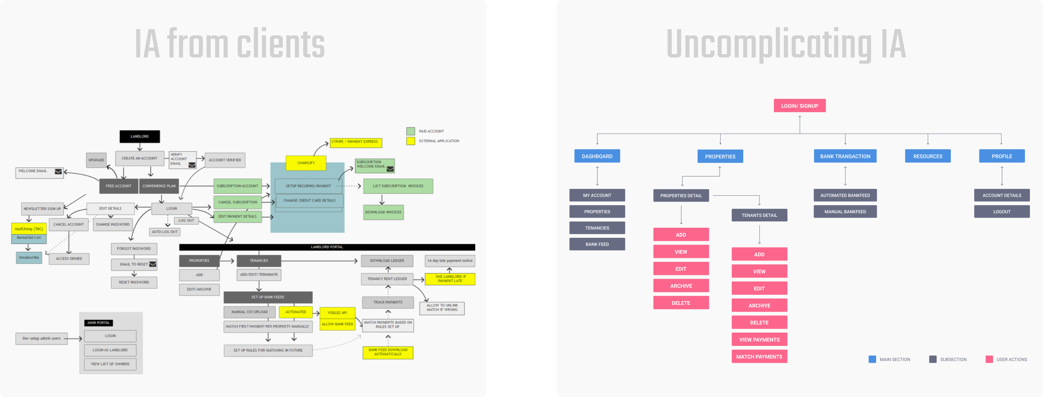
In order to understand the envisioned system, I had to undertake multiple sessions with the stakeholders to decode the Information architecture of the platform
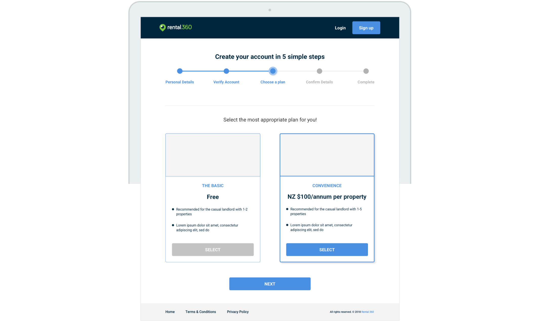
Easy onboarding
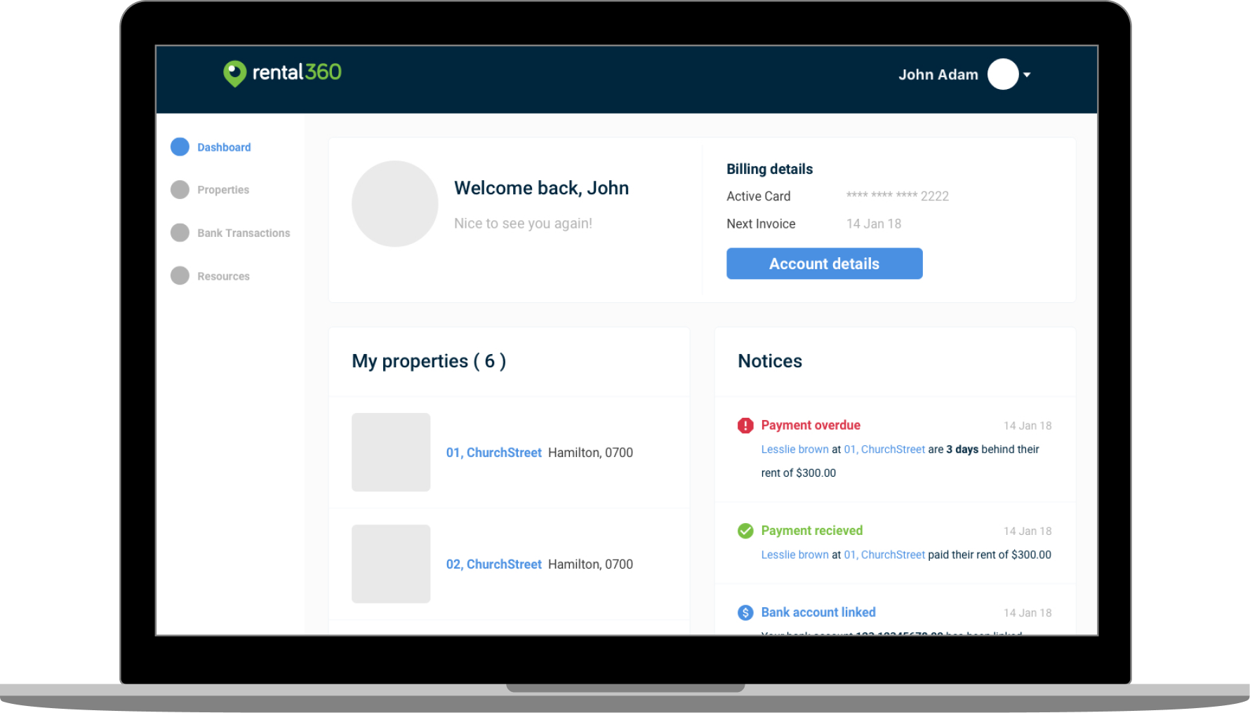
Focus on visibility of system status by keeping the user well informed of all the actions that he needs to perform
Impact: Trasparent visibility of actions done and actions to do.
Focus on visibility of system status by keeping the user well informed of all the actions that he needs to perform
Impact: Trasparent visibility of actions done and actions to do.
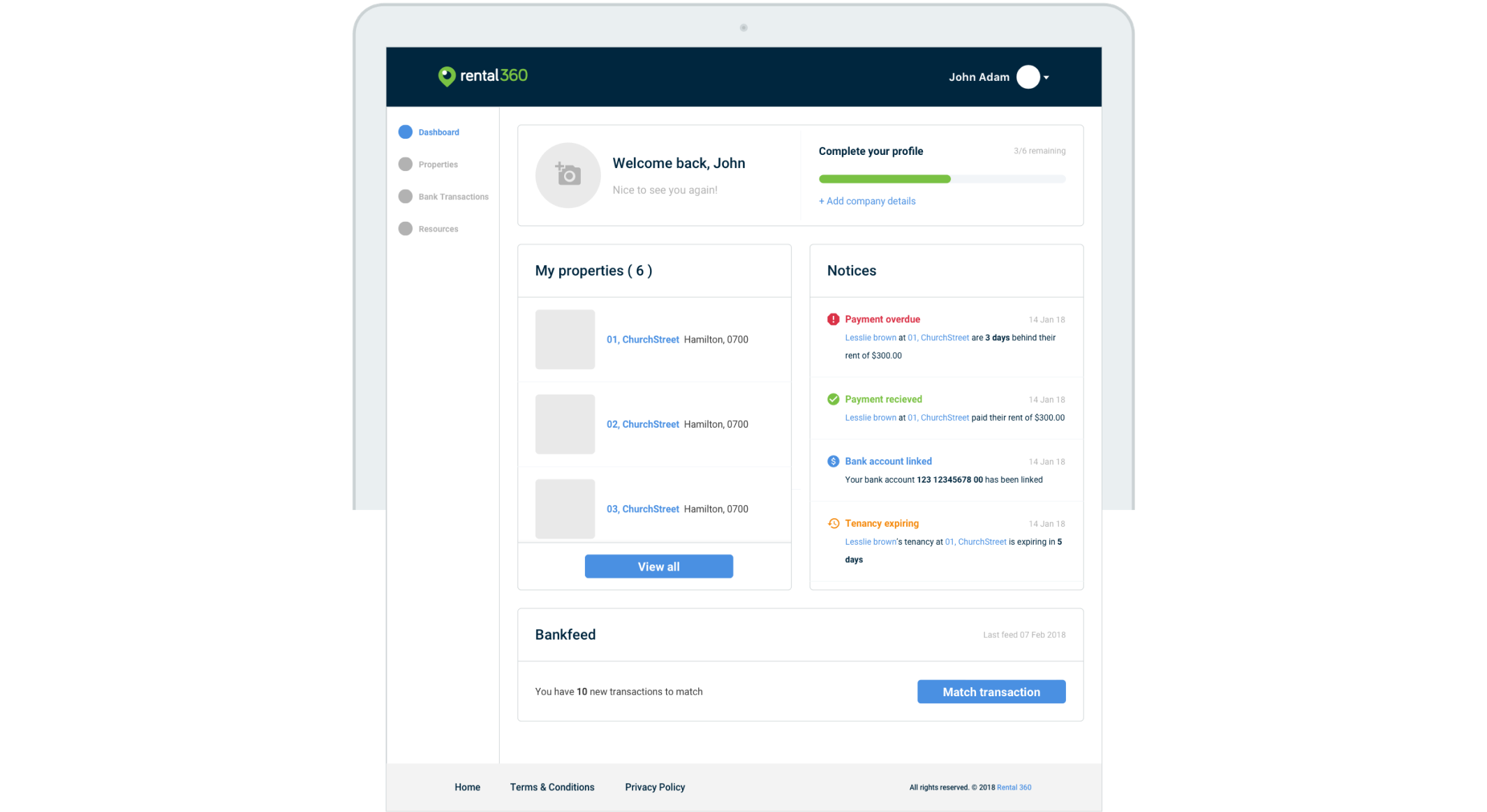
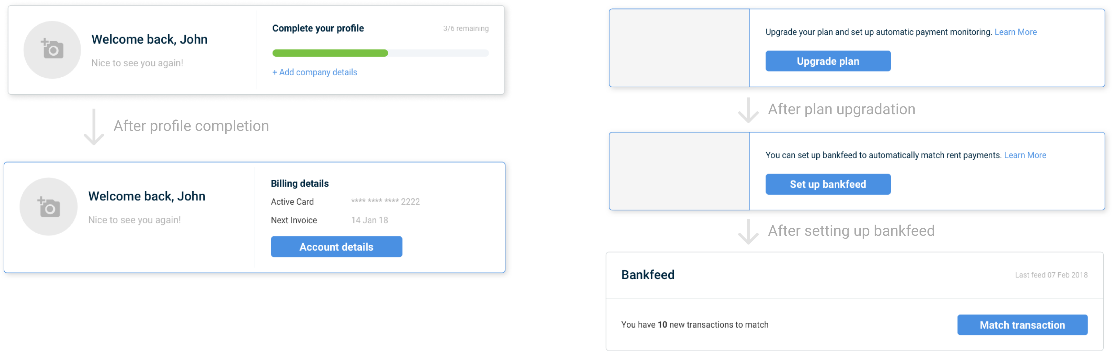
Flexible sectioning
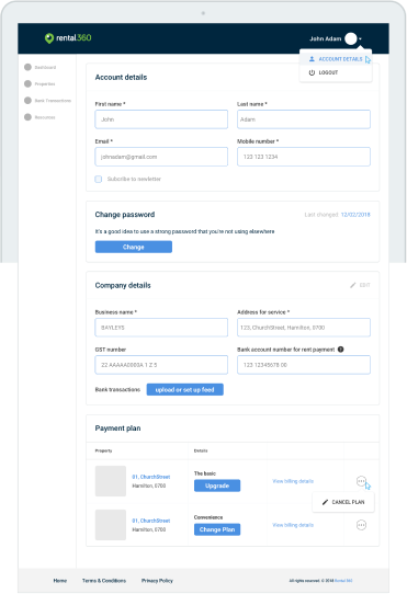
Sections on the homepage were designed to be flexible, so that based on context it shows the most important peice of information.
Some evolutions for these sections include:
• Providing a hook for profile completion on the home page which evolves into showing bank details.
• Hook for plan upgrade which evolves unto bankfeed once upgraded
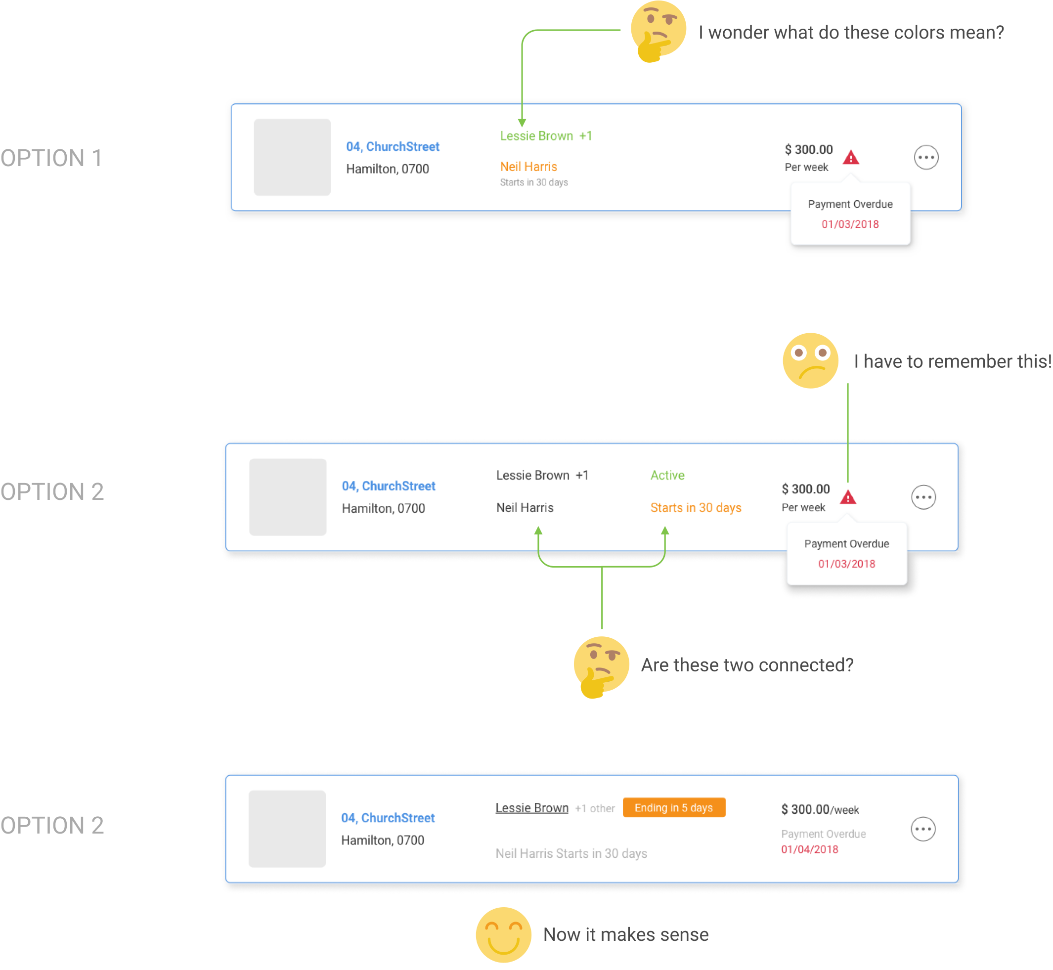
Heavy peer testing
Complicated sections were simplified through constant feedback from peers and stakeholders.
This often meant the design rapidly evolved to solve for specific use-cases.
Complicated sections were simplified through constant feedback from peers and stakeholders.
This often meant the design rapidly evolved to solve for specific use-cases.